Understanding user challenges
ZipSmart had users, a working model, and 3 failed designers. The product wasn't earning the trust the data deserved. I was next.
Real estate is one of the most financially consequential decisions most people ever make. ZipSmart was built to change how buyers, sellers, investors, and renters navigate that decision — turning complex market data into reports people can actually act on.
Arvin (CEO) needed someone who could see the vision — and then pressure-test it.
The business problem
The roadmap included a full marketing landing page alongside the core platform — which sounds reasonable until you ask the obvious question: what do you put on it? What features do you showcase when the platform itself isn't finished? What's the message that converts a visitor into a subscriber when you haven't validated what drives that conversion yet?
The team was spending real time and real money trying to answer a question they couldn't answer yet. The marketing website wasn't a communications problem — it was a symptom of building in the wrong order.

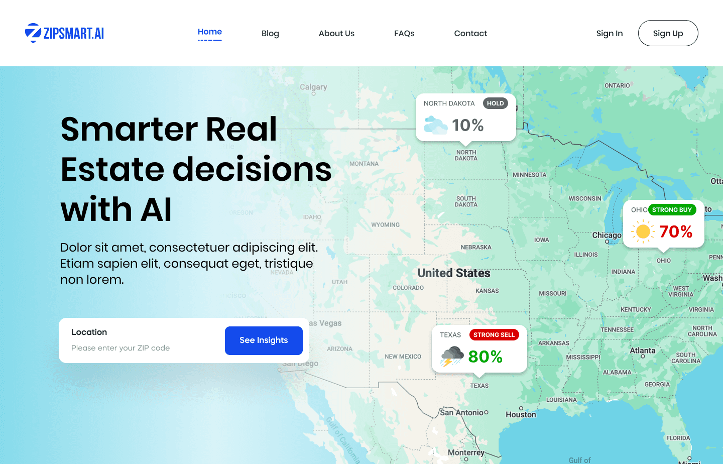


My recommendation: cut the marketing site entirely. Launch freemium instead.
Before touching a single screen, I spent time with Arvin understanding the business — not just the product brief. What I found was that the landing page wasn't the path to more paid subscribers. The product was.
Let users get inside the platform, experience the value directly, and convert on their own terms. Build the conversion path into the product — not in front of it.
That single decision reduced scope by 30%. It unblocked the team, clarified the narrative, and changed the entire framing of the launch.
Instead of "how do we explain ZipSmart", the question became "how do we make ZipSmart undeniable"
That's a much better design problem.

With the scope locked and the freemium model confirmed, every design decision had a clear job: convert free users into paid subscribers without friction or pressure.
Three principles drove the work:
Progressive disclosure as the conversion engine
Free users access state-level data — enough to prove the platform's value and build trust. Paid subscribers unlock city, zip code, and county-level insights. The tier boundary isn't a wall. It's the moment a user realizes they want more.
Data visualization as a decision tool, not a display
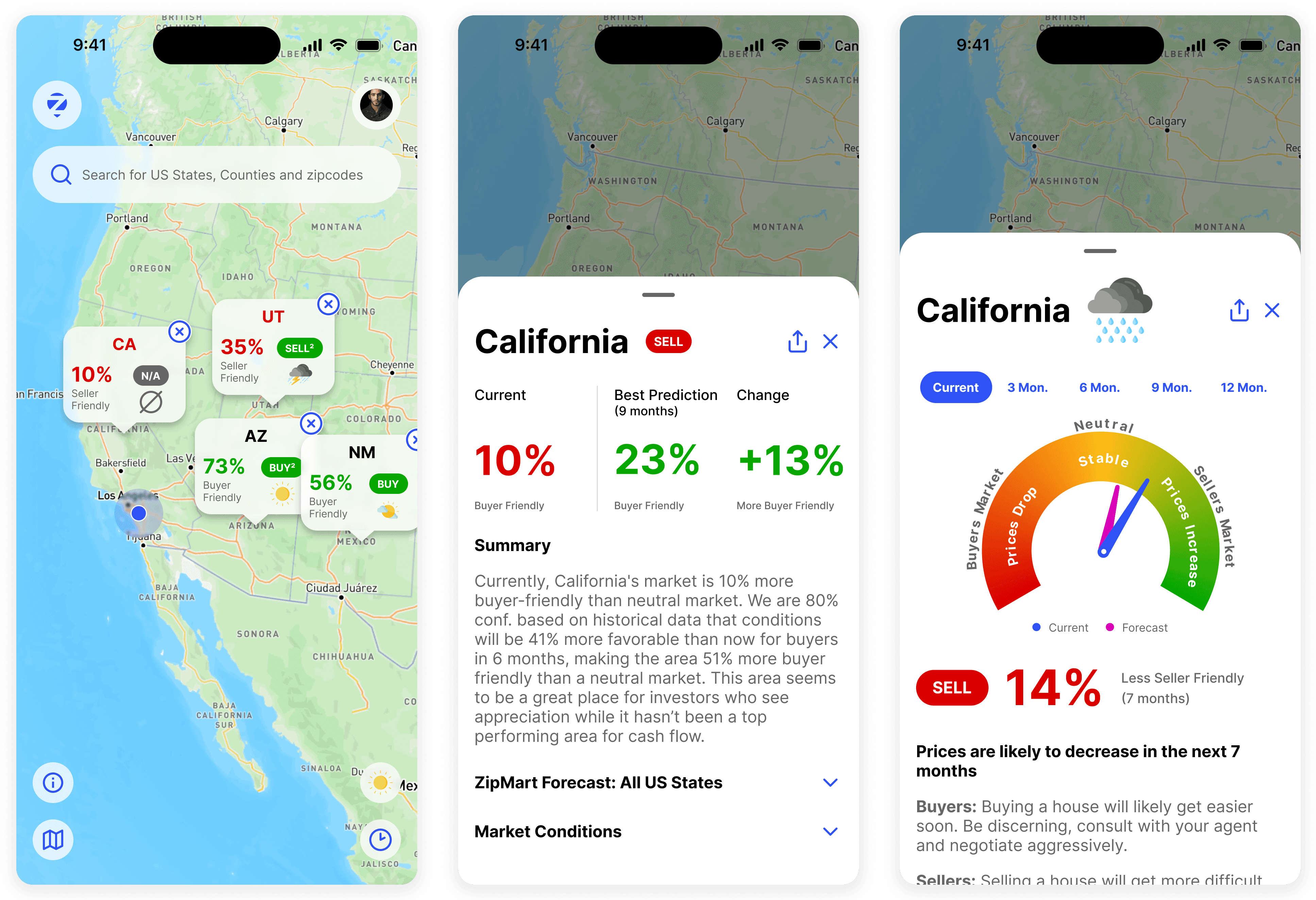
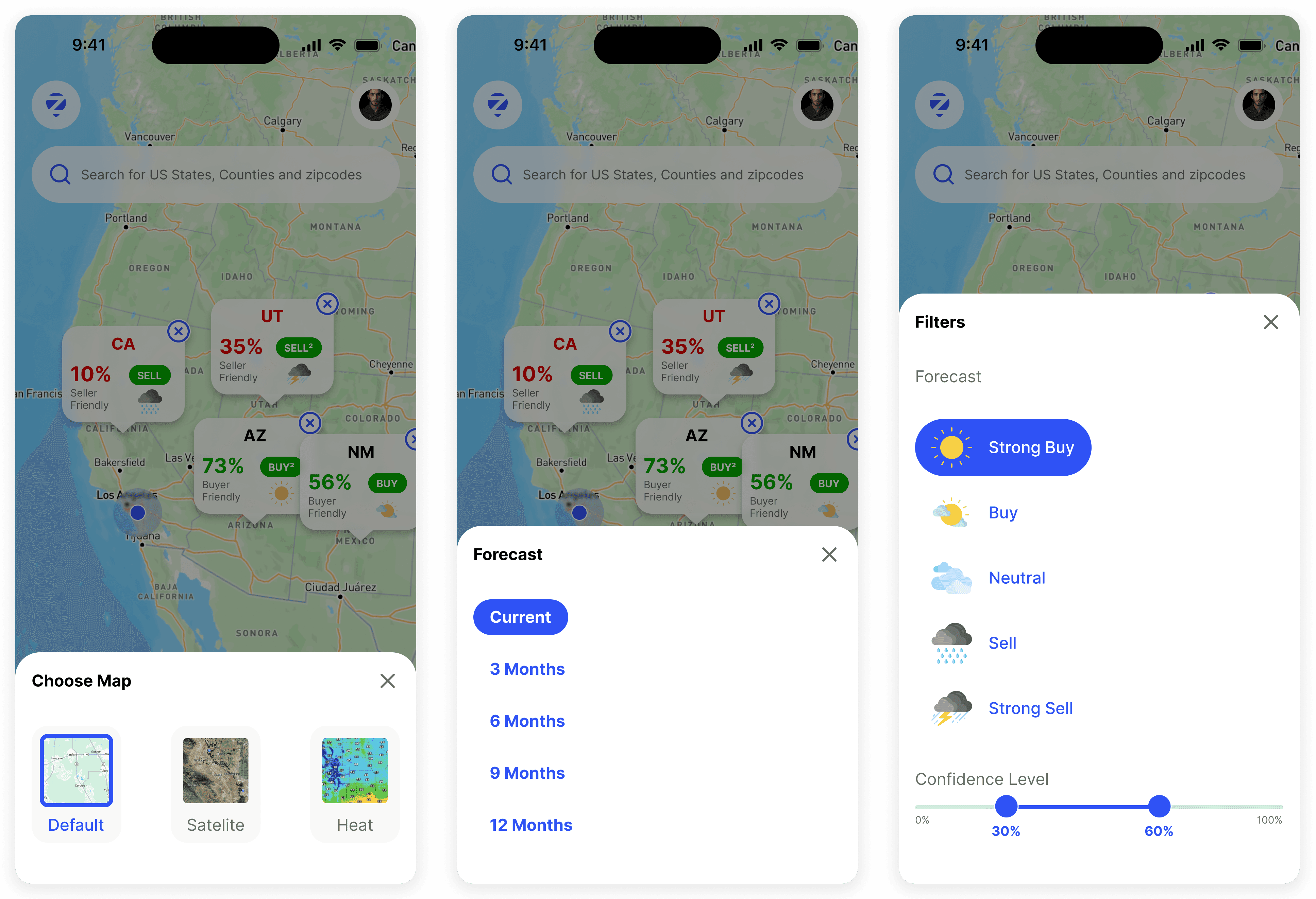
Every chart, map, and table was designed to answer a specific user question — not just to show that data exists. The interactive map became the platform's anchor: familiar, fast, and built to surface the insight users came for.
Visual credibility as a business asset
In real estate, trust is the product. The aesthetic needed to signal authority — clean, restrained, consistent — without intimidating the first-time buyer sitting next to the seasoned investor.


The final product addressed all three personas through a single, and cohesive experience
State, city, zip code, and county-level market data with tiered access
Actionable reports tailored to four user personas — buyers, sellers, investors, and renters
A flexible profile system that adapts the experience based on user type
Mobile-optimized layouts ensuring consistency across devices
A freemium conversion model built directly into the product flow
The MVP launched ahead of schedule, with time to test. The scope reduction meant the team shipped something focused and polished instead of overextended and half-finished.
Within three months, the freemium model drove a 13% increase in paid subscriptions — direct validation that letting the product sell itself was the right call. The interface became a core asset in ZipSmart's seed funding round, with investors responding to the clarity and professionalism of the experience. No major UI revisions were required post-launch.